ShopDreamUp AI ArtDreamUp
Deviation Actions


![[GIFT] Starknight Nirvana](https://images-wixmp-ed30a86b8c4ca887773594c2.wixmp.com/f/61b6cef9-ace6-40ef-aff6-0f26827a41e8/dcqweq9-0bb197ac-82c3-409c-add2-a0e12d628090.png/v1/crop/w_184,h_184,x_0,y_28,scl_0.076666666666667,q_70,strp/_gift__starknight_nirvana_by_shaozchampion_dcqweq9-92s-2x.jpg?token=eyJ0eXAiOiJKV1QiLCJhbGciOiJIUzI1NiJ9.eyJzdWIiOiJ1cm46YXBwOjdlMGQxODg5ODIyNjQzNzNhNWYwZDQxNWVhMGQyNmUwIiwiaXNzIjoidXJuOmFwcDo3ZTBkMTg4OTgyMjY0MzczYTVmMGQ0MTVlYTBkMjZlMCIsIm9iaiI6W1t7ImhlaWdodCI6Ijw9MTYzOSIsInBhdGgiOiJcL2ZcLzYxYjZjZWY5LWFjZTYtNDBlZi1hZmY2LTBmMjY4MjdhNDFlOFwvZGNxd2VxOS0wYmIxOTdhYy04MmMzLTQwOWMtYWRkMi1hMGUxMmQ2MjgwOTAucG5nIiwid2lkdGgiOiI8PTEwMjQifV1dLCJhdWQiOlsidXJuOnNlcnZpY2U6aW1hZ2Uub3BlcmF0aW9ucyJdfQ.sNOpz5lp9RM-0kyGLCeCDYDO3jBS_bqbcUVKYnNsXNw)
![[GIFT] Starknight Nirvana](https://images-wixmp-ed30a86b8c4ca887773594c2.wixmp.com/f/61b6cef9-ace6-40ef-aff6-0f26827a41e8/dcqweq9-0bb197ac-82c3-409c-add2-a0e12d628090.png/v1/crop/w_92,h_92,x_0,y_14,scl_0.038333333333333,q_70,strp/_gift__starknight_nirvana_by_shaozchampion_dcqweq9-92s.jpg?token=eyJ0eXAiOiJKV1QiLCJhbGciOiJIUzI1NiJ9.eyJzdWIiOiJ1cm46YXBwOjdlMGQxODg5ODIyNjQzNzNhNWYwZDQxNWVhMGQyNmUwIiwiaXNzIjoidXJuOmFwcDo3ZTBkMTg4OTgyMjY0MzczYTVmMGQ0MTVlYTBkMjZlMCIsIm9iaiI6W1t7ImhlaWdodCI6Ijw9MTYzOSIsInBhdGgiOiJcL2ZcLzYxYjZjZWY5LWFjZTYtNDBlZi1hZmY2LTBmMjY4MjdhNDFlOFwvZGNxd2VxOS0wYmIxOTdhYy04MmMzLTQwOWMtYWRkMi1hMGUxMmQ2MjgwOTAucG5nIiwid2lkdGgiOiI8PTEwMjQifV1dLCJhdWQiOlsidXJuOnNlcnZpY2U6aW1hZ2Uub3BlcmF0aW9ucyJdfQ.sNOpz5lp9RM-0kyGLCeCDYDO3jBS_bqbcUVKYnNsXNw)
![[GIFT] Dominican Princess](https://images-wixmp-ed30a86b8c4ca887773594c2.wixmp.com/f/61b6cef9-ace6-40ef-aff6-0f26827a41e8/dbc18s5-ef0d519b-d779-4593-9a1f-4ebd372f6c4d.png/v1/crop/w_184,h_184,x_0,y_28,scl_0.184,q_70,strp/_gift__dominican_princess_by_shaozchampion_dbc18s5-92s-2x.jpg?token=eyJ0eXAiOiJKV1QiLCJhbGciOiJIUzI1NiJ9.eyJzdWIiOiJ1cm46YXBwOjdlMGQxODg5ODIyNjQzNzNhNWYwZDQxNWVhMGQyNmUwIiwiaXNzIjoidXJuOmFwcDo3ZTBkMTg4OTgyMjY0MzczYTVmMGQ0MTVlYTBkMjZlMCIsIm9iaiI6W1t7ImhlaWdodCI6Ijw9MTYwMCIsInBhdGgiOiJcL2ZcLzYxYjZjZWY5LWFjZTYtNDBlZi1hZmY2LTBmMjY4MjdhNDFlOFwvZGJjMThzNS1lZjBkNTE5Yi1kNzc5LTQ1OTMtOWExZi00ZWJkMzcyZjZjNGQucG5nIiwid2lkdGgiOiI8PTEwMDAifV1dLCJhdWQiOlsidXJuOnNlcnZpY2U6aW1hZ2Uub3BlcmF0aW9ucyJdfQ.acO_vD4LM76WrJvbgnE36_NfJF8B948guDW08Hc07so)
![[GIFT] Dominican Princess](https://images-wixmp-ed30a86b8c4ca887773594c2.wixmp.com/f/61b6cef9-ace6-40ef-aff6-0f26827a41e8/dbc18s5-ef0d519b-d779-4593-9a1f-4ebd372f6c4d.png/v1/crop/w_92,h_92,x_0,y_14,scl_0.092,q_70,strp/_gift__dominican_princess_by_shaozchampion_dbc18s5-92s.jpg?token=eyJ0eXAiOiJKV1QiLCJhbGciOiJIUzI1NiJ9.eyJzdWIiOiJ1cm46YXBwOjdlMGQxODg5ODIyNjQzNzNhNWYwZDQxNWVhMGQyNmUwIiwiaXNzIjoidXJuOmFwcDo3ZTBkMTg4OTgyMjY0MzczYTVmMGQ0MTVlYTBkMjZlMCIsIm9iaiI6W1t7ImhlaWdodCI6Ijw9MTYwMCIsInBhdGgiOiJcL2ZcLzYxYjZjZWY5LWFjZTYtNDBlZi1hZmY2LTBmMjY4MjdhNDFlOFwvZGJjMThzNS1lZjBkNTE5Yi1kNzc5LTQ1OTMtOWExZi00ZWJkMzcyZjZjNGQucG5nIiwid2lkdGgiOiI8PTEwMDAifV1dLCJhdWQiOlsidXJuOnNlcnZpY2U6aW1hZ2Uub3BlcmF0aW9ucyJdfQ.acO_vD4LM76WrJvbgnE36_NfJF8B948guDW08Hc07so)
![[COM] Starknight Gia](https://images-wixmp-ed30a86b8c4ca887773594c2.wixmp.com/f/61b6cef9-ace6-40ef-aff6-0f26827a41e8/de78zry-b6bb07a2-eaf4-415a-9c0a-a8e1295a4887.png/v1/crop/w_184,h_184,x_0,y_28,scl_0.076666666666667,q_70,strp/_com__starknight_gia_by_shaozchampion_de78zry-92s-2x.jpg?token=eyJ0eXAiOiJKV1QiLCJhbGciOiJIUzI1NiJ9.eyJzdWIiOiJ1cm46YXBwOjdlMGQxODg5ODIyNjQzNzNhNWYwZDQxNWVhMGQyNmUwIiwiaXNzIjoidXJuOmFwcDo3ZTBkMTg4OTgyMjY0MzczYTVmMGQ0MTVlYTBkMjZlMCIsIm9iaiI6W1t7ImhlaWdodCI6Ijw9MjA0OCIsInBhdGgiOiJcL2ZcLzYxYjZjZWY5LWFjZTYtNDBlZi1hZmY2LTBmMjY4MjdhNDFlOFwvZGU3OHpyeS1iNmJiMDdhMi1lYWY0LTQxNWEtOWMwYS1hOGUxMjk1YTQ4ODcucG5nIiwid2lkdGgiOiI8PTEyODAifV1dLCJhdWQiOlsidXJuOnNlcnZpY2U6aW1hZ2Uub3BlcmF0aW9ucyJdfQ.jiLY9rUu6ewrY-slwubdtoZCumf1xZ5E7vV-x4zBqiY)
![[COM] Starknight Gia](https://images-wixmp-ed30a86b8c4ca887773594c2.wixmp.com/f/61b6cef9-ace6-40ef-aff6-0f26827a41e8/de78zry-b6bb07a2-eaf4-415a-9c0a-a8e1295a4887.png/v1/crop/w_92,h_92,x_0,y_14,scl_0.038333333333333,q_70,strp/_com__starknight_gia_by_shaozchampion_de78zry-92s.jpg?token=eyJ0eXAiOiJKV1QiLCJhbGciOiJIUzI1NiJ9.eyJzdWIiOiJ1cm46YXBwOjdlMGQxODg5ODIyNjQzNzNhNWYwZDQxNWVhMGQyNmUwIiwiaXNzIjoidXJuOmFwcDo3ZTBkMTg4OTgyMjY0MzczYTVmMGQ0MTVlYTBkMjZlMCIsIm9iaiI6W1t7ImhlaWdodCI6Ijw9MjA0OCIsInBhdGgiOiJcL2ZcLzYxYjZjZWY5LWFjZTYtNDBlZi1hZmY2LTBmMjY4MjdhNDFlOFwvZGU3OHpyeS1iNmJiMDdhMi1lYWY0LTQxNWEtOWMwYS1hOGUxMjk1YTQ4ODcucG5nIiwid2lkdGgiOiI8PTEyODAifV1dLCJhdWQiOlsidXJuOnNlcnZpY2U6aW1hZ2Uub3BlcmF0aW9ucyJdfQ.jiLY9rUu6ewrY-slwubdtoZCumf1xZ5E7vV-x4zBqiY)


Comments8
Join the community to add your comment. Already a deviant? Log In
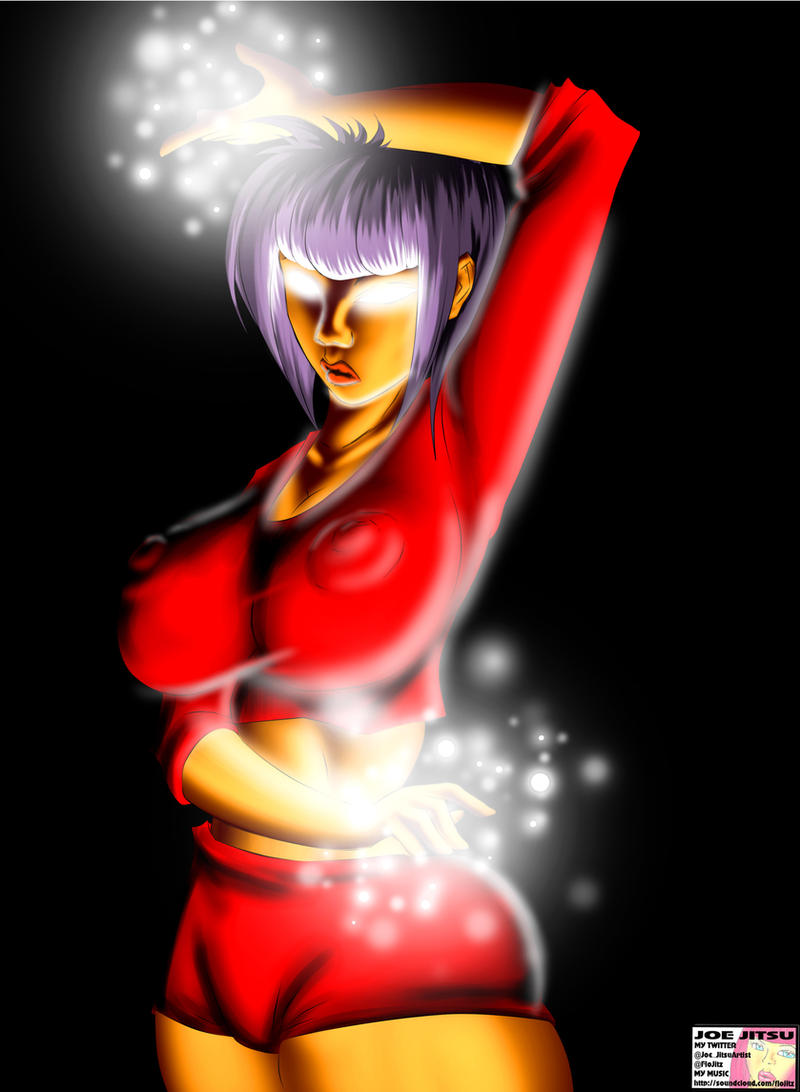
Hero showing off their powers pose which is cool. The hair is really very good, well defined, well lit and with just the right number of colours and shapes to tell you it's hair without spoiling the purity of the colours by getting bogged down in too much detail.
The lineart is exceptionally clean and easy to read, you could vary some of the line weights to give the figure a bit more punch but that's a minor complaint.
The waist width and left arm placement could be adjusted slightly the pose seems a little awkward as the left elbow is obscuring the other side of the waist making it appear too thin. The left hand is well observed, light and looks right.
The right hand should probably be rotated slightly so more of the knuckles can be seen as the current position while on its own looks fine coupled with the right arm appears almost painfully rotated. It's possible the right bicep is fractionally too long but given the height of the right shoulder it's a very slight distance.
The lighting seems well observed more subtle tonal variations and textile folds would be good as they'd complement the hair with tonal and visual complexity. Additionally the lighting on the body should probably be treated the same as the hair with only slight and broken glows emanating to give the image even more detail and depth.
Vision - This is a textbook 'awe' shot of a middle-power character and as such is compelling, I want to know what who she is and how she does what she does and why.
Originality - It is a textbook 'awe' shot as such unless she reaches out of the screen you're at 2.5 but the pose is pretty cool so you got 3.0.
Technique - Detail, the hair alone is a solid 4.0 as good as anything in any full on anime for colour tones and much more complex in terms of shading detail. The clothes and lighting on the body look like you need take a step back. Take some time don't get bored with the picture and the subject take a break and stay enthused. It's solid lineart and the hair proves you can perform greater tonal subtlety and detail. Altogether that leaves you at an average of 2.5.
Impact - With a couple of proportion shifts and the same type of detail as the hair repeated throughout you'll be at a solid 4.0 in no time. As it stands this is a competent pre-paint for when you have an extra 8-12 hours to put in on the shading.
That's what I think anyways, hope it helps <img src="e.deviantart.net/emoticons/s/s…" width="15" height="15" alt="